Six weeks trying to break our own driver chart
A driver chart tells a business which reasons behind a score deserve budget. Nobody can test one against a real survey, because nobody knows the true reasons behind a real customer's score. So we built simulated surveys where we did know the reasons, ran our own chart on them for six weeks, with each round's pass rules written down before that round's data existed, and kept a record of what happened.
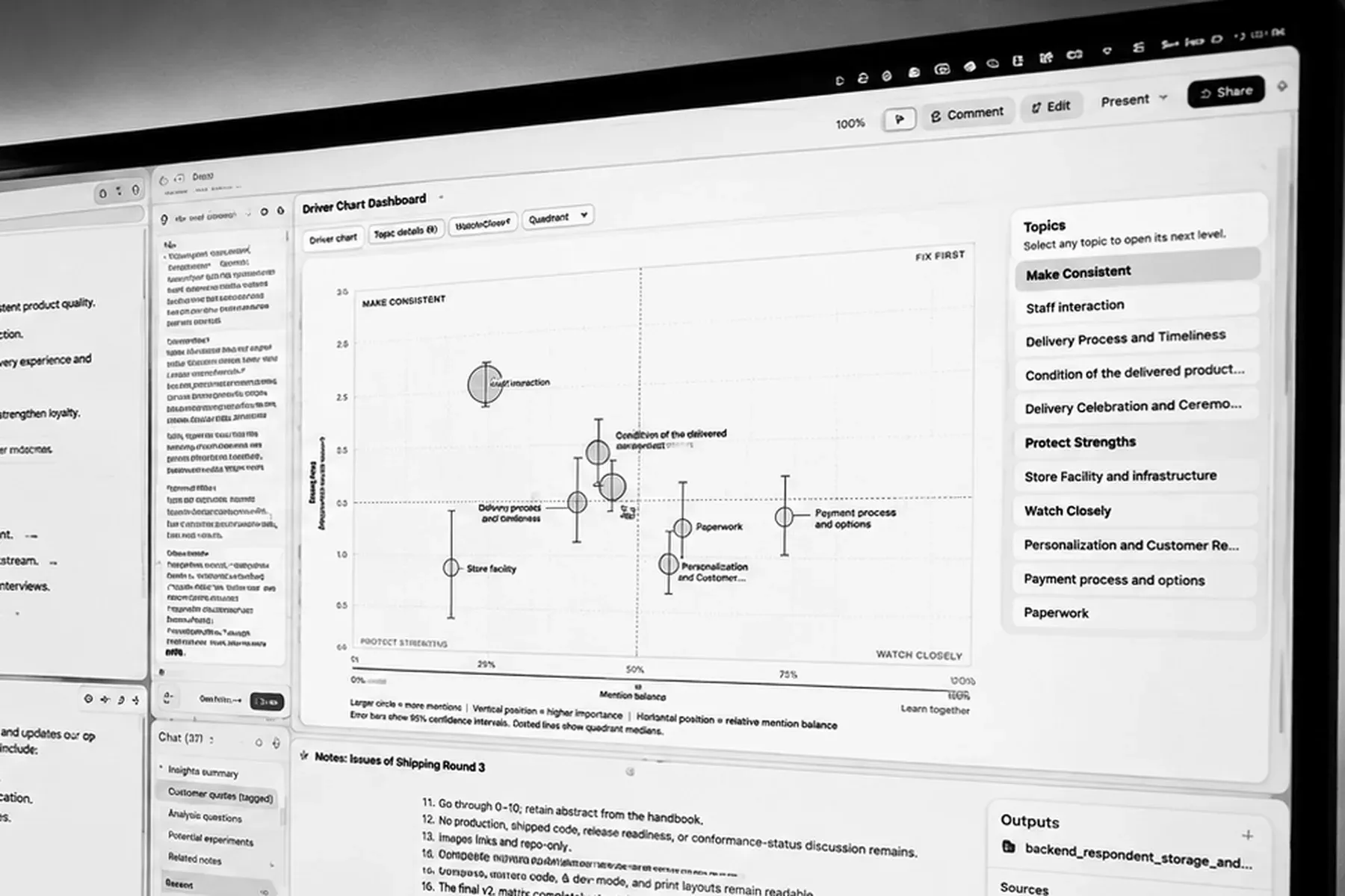
Somewhere today a manager is reading a chart with bubbles on it. Each bubble stands for a reason customers gave for their score. The chart comes from driver analysis, a way of taking every reason customers give and working out which ones go with a lower score. It tells her which reasons matter most. Next week she will move budget toward one of them, and a team will spend a year on it.
We make one of those charts. In August and September 2026 we spent six weeks trying to find out whether ours could be trusted. Each round's pass rules were written down before that round's data existed and did not change once its results came in.
Why we wanted to test it
The driver chart tells a business what to work on next, so budget follows the chart, and a year of somebody's work follows the budget. A score tells it where it stands, and a trend tells it which way it is moving.
Nobody can check a driver chart against a real survey, because nobody knows the true reasons behind a real customer's score. A wrong driver chart looks the same as a right one. The business fixes the wrong thing, the score stays put, and a year later nobody can say why.
We had run into this early on with real data. One reason appeared to make customers happier, and on a closer look the good news came from an accident of which customers had checked which boxes. Customers raise several issues at once, and averaging one box at a time counts the same person over and over. We had a driver chart in our own product and no way to test whether it deserved trust.
Surveys where we knew the answer
We already had the chart, built on math that has been around for a long time, and computing time had recently become cheap enough to let us check it properly.
To check a chart, you make up whole crowds of customers and decide ahead of time which reasons are really hurting their scores. Then you run your method on them many times over and count how often it found what you planted and how often it invented something you did not. Writing down the answers for our opening test alone took roughly 551 million rows of simulated data. The largest single run covered 562 survey situations, each with its own answer key, and produced 10,000 charts for each one. Across the six weeks we ran through more than a billion simulated customers.
For each situation we wrote the true answer down first and kept it from the method until it had reported. Then we built a survey to match, ran our driver analysis on it, and compared the two.
We set the whole thing up as a contest. Several methods entered, each with many possible settings. There would be a practice round, then the main test, then a final run to confirm a winner picked by a rule fixed in advance. A second, separate system reviewed each stage looking for mistakes. It found plenty, including tests that passed for the wrong reason, code that never ran, and claims in our own notes that we had not checked. All of it went back into the design.
137 candidate settings lined up for the main test. Going in, we expected the open question to be which one would win.
The first test
The test ran, and zero of 137 settings passed. The result came back as no method selected.
The final run never started, because there was nothing to confirm, and our own rule said we could not fall back on the setting with the fewest failures.
None of the settings met every rule in every situation we had built. That did not mean every method was bad or that regression does not work, and it did not tell us why nothing had won.
Why nothing passed
The scorecard held 181 checks. Some method or other had cleared 172 of them. Nothing had cleared the other 9.
We took those nine apart, and several could not be met by any method. One pair of rules worked against each other. One rule said a certain driver had to be found. The other said the chart must show nothing unless at least 30 people had raised the reason. In the situation both rules applied to, about 10 people had raised it. No method can turn 10 people into 30, and that part of our own test could not be passed at all.
Four kinds of question
The nine failed checks pointed at our fixed cutoff for deciding which drivers got shown. We replaced it with a rule that adjusts to how much evidence the data actually holds. In the situations we tested, the adjusting rule was much better at keeping fake reasons off the chart and at staying quiet when nothing real had been planted.
We also laid the four kinds of survey question side by side.
- Reasons checked off a list. The customer sees a row of boxes and checks as many as apply, or none.
- One most important reason. Each customer gets a single pick, so choosing one means passing on the rest.
- A comment sorted into topics. The customer writes freely, and software decides which topics the comment belongs to.
- Ratings on a scale. There are no boxes, just a number for each item, like service or price.
The four types differ in who counts as having answered and in what a driver gets compared against.
We stopped looking for a single winner. We kept one shared piece, meaning the way an effect gets estimated and how sure we have to be before showing it. Then we set up four separate tests, one for each kind of question, all held to the same standard.
The second round
We ran the second round with the rules written down first, the adjusting rule in place, and the review system reading along.
The second round also produced no winner, and the failures looked different this time. The false alarm numbers, which count invented problems, sat well inside their limits. Most of the failures fell on our list of nine, the checks we already knew could not be met.
Then three of the four kinds ran together. Comments sorted into topics passed, and so did ratings on a scale. Reasons checked off a list failed. The fourth kind, one most important reason, would get its own run later.
The one that failed
The rule under test dropped any reason that too few people had checked.
We had built one situation to be a nuisance. It held a rare but serious reason, raised by a handful of customers who scored much lower, next to two harmless look-alike options that the same unhappy customers tended to check. The real reason fell below the cutoff and got dropped from the calculation. With it gone, the two look-alikes soaked up its effect and came out as drivers. The chart presented two things that did not matter as things to fix.
Dropping a rarely checked reason is meant to keep weak evidence off the chart. In this test, it put two false problems on the chart.
What we tried
We tried seven fixes, one after another.
Two made it worse:
- Requiring 100 people before a reason could stay in the calculation. That floor blocked the very reason we needed to keep.
- Giving an unusual customer zero weight. It was meant to fix a numerical problem in rare cases, and it made some error bars 4 to 6 times too small.
Three did not work:
- A test for whether two options could be told apart. It failed when one option was really two others combined.
- A minimum survey size, first 300 and then 150. We dropped it, because the smallest size you happened to test is not a limit you have proven.
- Making every error bar a tenth wider. It was aimed at weak drivers looking too large, and it did not fix that.
One fixed one thing and broke another:
- Dropping one of two overlapping options. The math came right, but where one option contained the other, the chart still blamed the wrong one about half the time.
One worked:
- Removing the 100-person floor entirely, the reverse of the fix that made things worse. False look-alike drivers fell from somewhere between 66 and 82% down to about 1%.
Then we decided that a customer who is shown a list and checks nothing has not answered that question. Those customers come out of that question's chart and stay in the charts for the questions they did answer. That change altered the right answers in the simulations, so every stored answer had to be computed again.
The rerun
The corrected rule ran again on the corrected answer keys and passed every requirement. In the main set of tests in that run, strong drivers were found in at least 98% of charts in every situation we scored. The requirement was 90%.
We ran the old rule alongside it on the same data, and it failed six requirements in the places our diagnosis had pointed to.
The fourth kind, one most important reason, then had its own run and passed. All four were now tested and confirmed, each finding strong drivers in at least 90% of charts in the conditions tested. The largest single run, for ratings on a scale, came to 5,620,000 simulated charts.
The rule we settled on says that when a reason is too rare to show on the chart, it stays in the calculation anyway. That holds for checked lists and for ratings on a scale, as long as the reason can still be measured. A comment topic that fails the test is removed instead. A reason that stays gets no bubble, and it is listed under the chart with the reason it is not shown and its count. The reader never sees it as a bubble. Keeping it in the calculation stops its effect from being credited to other reasons.
Where the chart stands now
We spent six weeks looking for ways this chart could fail. We built charts where nothing was real, to see whether it would stay quiet, and it usually did. False bubbles did appear now and then, and they stayed inside the limit we had set. We built surveys meant to confuse it, with two options nearly the same, and in that case the chart can show neither and say why. We fed it data it should refuse, like a score that never changes, and it refused.
The chart narrows the field first and then puts what is left in order. A survey collects every reason a customer might give. The chart cuts that list down to the few reasons with real evidence behind them, and it lists everything it left off along with the reason. Those few it orders by their estimated impact on the rating, which in plain terms means how much lower those customers scored than comparable customers. A higher bubble means a bigger estimated impact, and all else being equal, a higher priority on that measure. The error bars show how sure each estimate is. A clear gap between two bars is strong evidence that the higher one really is bigger. Bars that overlap leave the question open. The four corners of the chart carry names like Fix First and Make Consistent, and each name describes where a topic sits on the chart. The order comes from how high the bubble is. How a driver chart fits into a dashboard is covered in the dashboard article.
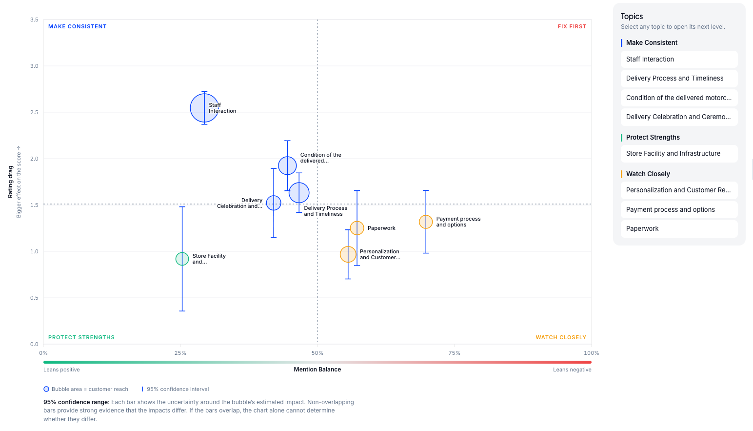
The chart shows a relationship in the survey, and it does not forecast what fixing something will do. Whether a CX program has paid off is a different question, and we answer that one by counting rather than modeling. A topic that is not shown was still checked, and it is listed with its reason. A comment chart is only as good as the labels the software gave the comments. For weak drivers that show up only now and then, the bubble can sit too high. We did not keep the data we would need to say by how much.
The manager from the opening still has her decision to make. She now gets a shorter list than the survey gave her, in order, with a reason under it for everything left off. These problems could have reached a real budget decision. We went looking for them.
Frequently asked questions
Does this mean driver analysis doesn't work?
No. Nothing won the two contests, partly because some of the rules could not be met by any method. When three of the four kinds of question were tested together against one shared standard, comments sorted into topics and ratings on a scale passed, and reasons checked off a list failed and then passed after a rule change. The fourth kind, one most important reason, was confirmed in its own run.
Why does the chart show fewer drivers than the survey asked about?
A reason is left off for one of four causes. Too few people raised it. There was no usable group to compare it against. It failed the evidence test. Or it was so tangled up with another reason that we could not tell which one carried the effect, and in that case the chart shows neither. Everything it held back is listed with its reason. A reason that is not shown may still have an effect.
Can I use the chart to decide what to fix first?
Yes, on one measure it can. The highest bubble has the largest estimated impact on the rating, and all else being equal, it is the highest priority on that measure. The error bar shows how sure that estimate is. A clear gap between two bars is strong evidence the higher one is bigger. Bars that overlap leave it open. The chart is not a forecast of how much the score will rise.