Benchmarks for Banking Product Usage
What good activation and usage actually look like across retail banking products.

Quick Summary (Updated)
- U.S. retail banks have invested heavily in digital onboarding, mobile platforms, and feature innovation. On paper, adoption looks strong. In reality, value realization tells a different story.
- Customer experience research consistently shows that access does not equal adoption. Customers open accounts, download apps, and complete onboarding but core features remain underused, secondary products never activate, and usage depth plateaus early in the lifecycle.
- In fact, industry research shows that a majority of digital banking customers use fewer than half of the features available to them, even after months of activity. The issue isn’t product quality or customer intent it’s visibility into how customers actually behave after onboarding.
- Most banks still rely on static, profile-based segmentation. These segments explain who the customer is, but they fail to explain how value is (or isn’t) being realized.
This article explains why behavior-based customer segmentation is now one of the most effective levers for improving product adoption in retail banking, and how CX, Product, and Operations teams can operationalize it at scale - without adding complexity.
So how do you know if your product usage is truly healthy or just statistically acceptable?
You’re tracking product usage more closely than ever.
Your dashboards show:
- Monthly active users are trending up
- Login frequency holding steady
- Feature engagement “within range.”
And yet, uncertainty remains.
- Is a 42% feature adoption rate strong or a warning sign?
- Is weekly usage healthy or masking shallow value realization?
- Is adoption improving or just stabilizing before decline?
Across U.S. retail banking, this uncertainty has become the norm. Teams have numbers, but not context.
The core issue is not lack of data. It is the lack of benchmarks that reflect real banking behavior.
Most adoption benchmarks used today are borrowed from SaaS, consumer apps, or generic digital products. They emphasize surface-level activity like logins, sessions, clicks without accounting for how banking customers actually realize value over time.
Customer experience research consistently shows that usage alone is a weak signal unless it’s interpreted through behavior, depth, and progression. Customers may log in frequently and still fail to adopt the features that drive retention, cost efficiency, or cross-product growth.
This is where benchmarks need to change.
As Jocelyn Brown, Head of Customer Success at Hypercontext, explains:
“Value realization is defined by the customer, and it is not static.”
That insight is critical for banking product usage.
A “good” adoption rate is not a fixed percentage.
A “healthy” usage pattern changes by:
- Product type
- Customer lifecycle stage
- Feature complexity
- Customer intent and confidence
Benchmarks that ignore this reality create false confidence.
They make shallow usage look like success, hide early disengagement behind averages, and delay intervention until outcomes are already compromised.
This article is designed to reset how banking teams think about product usage benchmarks.
You’ll learn:
- Why generic adoption benchmarks fail in retail banking
- Which usage metrics actually indicate value realization
- How to interpret adoption rates by product, feature, and lifecycle stage
- What “good” looks like, and when “average” is actually risky
Because in banking, benchmarks don’t exist to impress dashboards.
They exist to guide decisions before adoption stalls.

Why Generic Product Usage Benchmarks Fail in Banking
You’re not short on benchmarks. What you’re short on is benchmarks that actually mean something in banking.
When you ask, “Is our product usage good?”, the numbers you’re usually handed come from:
- Cross-industry benchmark reports
- Consumer app engagement studies
- SaaS-style adoption frameworks
They look polished and sound credible. But when you apply them to retail banking, they quietly lead you in the wrong direction.
Banking Usage Is Intent-Driven; Not Continuous
Most benchmarks assume one thing:
More usage equals more value.
That assumption might hold for SaaS products. It doesn’t hold for banking.
Your customers don’t open a banking app to “engage.” They open it to complete a task, build confidence, and move on.
That means:
- A customer logging in twice a month may be healthy
- A customer logging in daily may still be under-adopting
- Long gaps between sessions don’t automatically signal risk
If you apply generic frequency benchmarks, you end up flagging the wrong customers and missing the real adoption gaps.
When you look at usage without intent, you measure motion not progress.
Averages Hide the Signals You Actually Need
Most benchmark reports rely on averages:
- Average adoption rate
- Average feature usage
- Average engagement frequency
Averages feel safe. But in banking, they hide the very signals you need to act on.
Inside your “average” numbers, you often have:
- New customers failing to reach first value
- Shallow adopters counted as “active users”
- Power users stuck on one feature
- At-risk customers diluted by mature segments
When your dashboard says “within benchmark range,” the real question is:
Which customers are pulling that average up - and which ones are quietly falling behind?
If benchmarks don’t help you see that difference, they don’t protect adoption. They mask risk.
Not All Banking Features Should Benchmark the Same Way
Another mistake generic benchmarks push you toward:
Treating all features equally.
In reality, you already know this isn’t true.
Checking balances, setting up bill pay, managing cards, resolving disputes, or using budgeting tools all require different levels of effort, trust, and confidence.
When you compare them using a single adoption benchmark:
- High-effort features look “weak”
- Low-effort features look “successful”
- Teams optimize for what’s easy, not what’s valuable
This is how banks end up celebrating surface activity while deeper value drivers remain underused.
If your benchmarks don’t reflect feature complexity and customer effort, they push your teams in the wrong direction.
The Most Dangerous Outcome: False Confidence
The biggest risk of generic benchmarks isn’t that they show poor performance.
It’s the fact that they make you feel comfortable when you shouldn’t be.
They tell you:
- “Usage is fine.”
- “Adoption looks healthy.”
- “We’re in line with peers.”
Meanwhile:
- Value realization stalls
- Servicing costs stay high
- Cross-product adoption underperforms
- Customers disengage quietly
When benchmarks don’t surface behavioral drift, you find out too late after outcomes move, not before.
What You Actually Need From Banking Benchmarks
If benchmarks are going to help you drive adoption, they must:
- Reflect behavior progression, not just activity
- Change by product type and lifecycle stage
- Surface depth, confidence, and friction
- Help you decide what to do next, not just where you stand
Benchmarks should guide action not just provide reassurance.
That’s why leading banking teams are moving away from generic adoption percentages and toward behavior-anchored product usage benchmarks.
And that’s exactly what we’ll define next.
Why Usage Benchmarks Without Context Mislead Banking Teams
You’re tracking product usage more closely than ever. You have benchmarks, dashboards, and trend lines; yet uncertainty remains.
That’s because usage benchmarks without behavioral context create false confidence. In retail banking, numbers alone rarely explain whether customers are actually realizing value.
Benchmarks Answer “How Much”; Not “Why”
Most usage benchmarks tell you what is happening:
- 42% feature adoption
- 3.1 logins per month
- 68% of users active after onboarding
But they don’t tell you:
- Why customers adopted
- How deeply they’re using the feature
- Whether usage is progressing or plateauing
A benchmark might look reasonable, even strong; while masking shallow or fragile adoption.
The Banking-Specific Blind Spot
In retail banking, this gap is amplified because:
- Many features are optional but value-critical (budgeting, alerts, self-service tools)
- Customers can appear “active” while avoiding high-value workflows
- Usage declines happen quietly, not dramatically
This is why banks often discover adoption problems after value erosion has already set in.
Why “Average Usage” Is a Dangerous Metric in Banking
Averages feel safe. They’re easy to report and easy to defend.
But in banking, averages hide risk.
You might see:
- Stable MAU across the base
- Flat login frequency
- Feature usage “within benchmark range”
And still miss the fact that:
- One segment is accelerating adoption
- Another is stagnating
- A third is quietly disengaging
What Averages Hide From CX and Product Teams
When teams rely on averages:
- CX can’t see who needs intervention
- Product can’t see where value breaks
- Ops can’t prioritize effort effectively
The result is benchmark complacency - numbers look fine, but adoption outcomes don’t improve.
This is exactly why the research emphasizes segment-aware interpretation, not single-point benchmarks.
Benchmarks Must Be Interpreted Through Customer Outcomes
Usage only matters if it maps to customer intent and value realization.
Customers don’t log in to be counted.
They log in to get something done:
- Complete a payment
- Resolve an issue
- Gain clarity or control
This is where benchmarks shift from descriptive to strategic.
As Lincoln Murphy, Customer Success Strategy Expert, notes:
“You can focus on adoption, retention, expansion, or advocacy, or you can focus on the customer’s desired outcome and get all of those things.”
, Lincoln Murphy
What This Means for Banking Benchmarks
For banking teams, this means:
- A “good” usage rate depends on what the customer is trying to achieve
- The same benchmark can signal success in one segment and risk in another
- Benchmarks must be read in sequence, not isolation
A feature adoption rate isn’t meaningful unless you know:
- Who adopted it
- How long it took
- Whether usage deepened or stalled
The Shift From Static Benchmarks to Diagnostic Benchmarks
High-maturity banks no longer ask:
“Are we above or below benchmark?”
They ask:
“What does this benchmark tell us about adoption health?”
Diagnostic Benchmarks Do Three Things
They help you:
- Detect early risk before churn signals appear
- Prioritize intervention by segment and product
- Explain adoption trends to leadership with confidence
This is the difference between benchmark reporting and benchmark intelligence.
Why This Section Matters Before We Show the Numbers
Before looking at specific usage benchmarks, one principle matters:
Benchmarks are not targets. They are signals.
Without context:
- You’ll defend numbers that don’t drive value
- You’ll miss segments that need attention
- You’ll optimize for optics instead of outcomes
In the next section, we’ll break down banking product usage benchmarks by category - not as “good vs bad” numbers, but as ranges with interpretation guidance your CX, Product, and Ops teams can actually use.
Core Banking Product Usage Benchmarks (And How to Read Them)
Once you accept that benchmarks are signals - not goals; the next step is knowing which benchmarks actually matter in retail banking and how to interpret them correctly.
The mistake most teams make is copying “industry averages” without context. In banking, usage benchmarks must be read through:
- Product type
- Customer intent
- Lifecycle stage
- Segment behavior
Below are the most reliable product usage benchmarks used across retail banking; especially across North America, framed as interpretive ranges, not pass-fail scores.
Digital Banking Activation Rate
What it measures
The percentage of customers who complete at least one meaningful digital action after onboarding (not just account creation or login).
Typical benchmark range
60–75% within the first 30 days
How to Interpret This Benchmark
- Below 60% - Indicates onboarding friction, unclear value, or delayed first-win moments.
- 60–70% - Acceptable, but often masks segment-level drop-off.
- Above 70% - Strong activation; only if followed by repeat usage.
What teams often miss
High activation without follow-through often creates false confidence. Activation should always be paired with time-to-value and repeat usage benchmarks.
Monthly Active Usage (MAU) for Core Banking Features
What it measures
The percentage of digitally onboarded customers who perform at least one core action in a given month (e.g., transfers, bill pay, card management).
Typical benchmark range
45–65% MAU
How to Interpret This Benchmark
- Below 45% - Indicates weak habit formation or reliance on non-digital channels.
- 45–55% - Stable but shallow usage is common here.
- Above 60% - Strong usage if actions reflect value-driving behavior.
Important nuance
A customer logging in to “check balance” once a month counts as MAU - but may not represent real adoption. This is why MAU must be read alongside feature depth.
Feature Adoption Depth (Beyond Login Metrics)
What it measures
How many value-driving features a customer actively uses - not just whether they log in.
Typical benchmark range
2–3 features per active customer
How to Interpret This Benchmark
- 1–2 features - Shallow adoption. Customers are active but fragile.
- 2–3 features - Healthy baseline adoption.
- 4+ features - Strong value realization and lower churn risk.
Why this matters
Research consistently shows that customers using multiple features are significantly more resilient to pricing changes, friction, and competitive offers.
Weekly Usage Frequency (Habit Strength Indicator)
What it measures
The percentage of active users who engage weekly with at least one digital banking capability.
Typical benchmark range
20–35% weekly active users
How to Interpret This Benchmark
- Below 20% - Indicates weak habit formation.
- 20–30% - Normal for transactional banking products.
- Above 30% - Strong signal of embedded usage, especially when tied to recurring tasks.
Key insight
Weekly usage is one of the strongest leading indicators of long-term retention - far more predictive than satisfaction scores.
Time-to-First-Value (TTV)
What it measures
How long it takes a customer to complete their first meaningful, value-realizing action.
Typical benchmark range
3–7 days post-onboarding
How to Interpret This Benchmark
- Under 3 days - Excellent onboarding clarity.
- 3–7 days - Acceptable but segment-dependent.
- Beyond 7 days - Early warning signal for stalled adoption.
Why this matters
The longer value is delayed, the more likely customers are to disengage quietly - without ever signaling dissatisfaction.
Drop-Off and Feature Abandonment Rates
What it measures
Where customers start but fail to complete key digital workflows.
Typical benchmark rang25–40% drop-off on non-core or complex features
How to Interpret This Benchmark
- Consistent drop-off at the same step - Indicates UX or comprehension issues.
- High abandonment after first use - Signals unclear value or unmet expectations.
- Rising abandonment post-release - Suggests regression or behavioral mismatch.
Critical reminder
Drop-off is not failure - it’s diagnostic data. It tells you where adoption breaks, not that it broke.
What “Good” Actually Looks Like in Banking Usage Benchmarks
There is no universal “good” benchmark. A healthy benchmark profile looks like this:
- Activation happens quickly
- Usage deepens over time
- Feature breadth expands by segment
- Drop-off decreases with iteration
If your benchmarks show stability without progression, adoption is likely stalling - even if numbers look “within range.”
Why Benchmarks Must Be Read Together (Not in Isolation)
High-performing banking teams never look at a single metric alone. They ask:
- Is activation improving and deepening?
- Is MAU stable and meaningful?
- Is feature usage expanding by segment?
- Is time-to-value shrinking?
Benchmarks are not verdicts. They are signals that tell you where to look next.
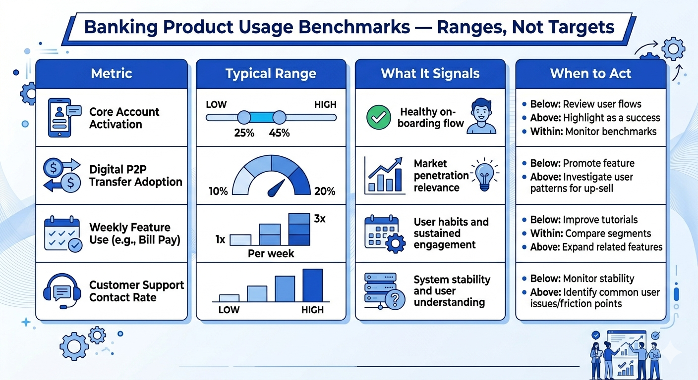
Benchmarks become dangerous when they’re treated as averages.
In retail banking, the same usage number can mean very different things depending on:
- Who the customer is
- Where they are in their lifecycle
- What job the product is supposed to do
If you’re asking, “Is this adoption rate good?”
The more useful question is:
“Good for whom and at what stage?”
This is where many banks misread their own data.
Why Aggregate Benchmarks Hide Adoption Risk
When you look at usage benchmarks in aggregate, they smooth out the very signals you need to act on.
For example:
- A 55% MAU may look healthy overall
- But inside that number:
- New customers may be stalling
- Power users may be plateauing
- At-risk segments may already be declining
- New customers may be stalling
From a distance, everything looks stable. Up close, adoption may already be breaking.
The Core Problem
Aggregate benchmarks answer:
“How are we doing on average?”
But adoption teams need answers to:
“Where is adoption improving, stalling, or quietly deteriorating?”
That requires segment-level interpretation.
New Customers vs. Established Customers (Same Metric, Different Meaning)
Let’s take activation rate as an example.
For new customers (0–30 days):
- A 65% activation rate may indicate:
- Delayed first value
- Onboarding friction
- Weak habit formation
- Delayed first value
For established customers (90+ days):
- A 65% activation-equivalent action rate may indicate:
- Normal, steady usage
- Low exploration but acceptable retention
- Normal, steady usage
Same number but a completely different implication.
How You Should Read This
- Early lifecycle benchmarks are about speed and momentum
- Later lifecycle benchmarks are about depth and consistency
If you don’t separate these, you’ll either:
- Overreact to normal behavior
- Or miss early adoption failure signals
Interpreting Feature Adoption Benchmarks by Segment
Feature adoption is one of the most commonly misread benchmarks in banking.
A 40% feature adoption rate could mean:
- Strong adoption for a complex capability (e.g., automated savings rules)
- Weak adoption for a core capability (e.g., bill pay)
What You Need to Ask Instead
When reviewing feature benchmarks, ask:
- Is this feature core or secondary?
- Is adoption expected immediately or over time?
- Does adoption require education, trust, or habit change?
A “low” benchmark may actually be healthy - and a “high” benchmark may still indicate shallow value realization.
Usage Frequency Benchmarks by Customer Intent
Weekly or monthly usage benchmarks only make sense when aligned to customer intent.
For example:
- A checking account customer may show:
- Frequent logins
- Shallow feature depth
- Frequent logins
- A savings-focused customer may show:
- Infrequent logins
- High-value actions when they do engage
- Infrequent logins
The Mistake to Avoid
Many teams treat lower frequency as disengagement.
In reality:
- Mismatch between expected and natural behavior is the real risk
- Not all valuable banking relationships are high-frequency relationships
Usage frequency must be interpreted relative to:
- Product role
- Customer goal
- Lifecycle stage
Segment-Level Benchmarks Reveal Where to Act
Once benchmarks are sliced by segment, patterns become actionable. For example, you may discover:
- New digital customers activate quickly but never expand
- Long-tenured customers maintain usage but stop discovering features
- One segment drives most support tickets despite “healthy” usage
These insights don’t appear in topline numbers.
This Is Where Benchmarks Become Operational
At this level, benchmarks stop being reports and start answering:
- Which segments need enablement?
- Which need friction removal?
- Which need no intervention at all?
That’s how benchmarks guide decisions; not just performance reviews.
Why Lifecycle Context Prevents False Alarms
Without lifecycle context, teams often panic unnecessarily.
Examples:
- Declining login frequency among mature users
- Stabilizing MAU after initial growth
- Reduced exploration after early adoption
These are not always negative signals.
The Right Question to Ask
Instead of:
“Why is usage no longer growing?”
Ask:
“Is usage evolving the way it should for this segment at this stage?”
Growth, stabilization, and even decline can all be healthy signals - if they align with expected customer progression.
What High-Maturity Teams Do Differently
Banks that use benchmarks effectively do three things consistently:
- They separate benchmarks by segment
- They interpret benchmarks by lifecycle
- They act on movement, not absolute numbers
They don’t ask:
“Are we above the industry average?”
They ask:
“Is adoption improving where it should, and breaking where it shouldn’t?”
That’s the difference between benchmarking for reporting
and benchmarking for adoption performance.

Common Mistakes Banks Make When Using Product Usage Benchmarks
Most banks don’t get benchmarks wrong because the numbers are bad.
They get them wrong because the questions behind them are incomplete.
When usage benchmarks are misused, they don’t just fail to help - they actively delay action, mask risk, and create false confidence.
Below are the most common mistakes we see across U.S. retail banking teams when benchmarking product usage - and why they matter.
Treating Benchmarks as Targets Instead of Diagnostics
One of the most damaging mistakes is using benchmarks as goals.
You’ll often hear:
- “We need to get feature adoption to 50%”
- “Industry MAU is 60%, we’re at 55%”
- “Let’s benchmark against top-quartile banks”
The problem?
Benchmarks are reference points, not objectives.
Why This Breaks Adoption Strategy
When benchmarks become targets:
- Teams optimize numbers instead of outcomes
- Short-term nudges replace long-term value realization
- Usage spikes briefly, then decays
High-maturity teams use benchmarks to ask:
“What does this signal tell us about adoption health?”
Not:
“How do we hit this number faster?”
Comparing Across the Wrong Peer Set
Another common error is benchmarking against banks that:
- Serve very different customer profiles
- Offer different product complexity
- Operate under different digital maturity constraints
A national bank with advanced self-service workflows will not show the same usage patterns as:
- A regional bank with branch-heavy servicing
- A credit union focused on relationship banking
The Result
You end up with conclusions like:
- “We’re underperforming”, when you’re not
- “We’re ahead of peers”, when risk is actually building
Benchmarks only work when peer context matches product role, customer intent, and operating model.
Relying on Single Metrics to Tell a Multi-Dimensional Story
Usage benchmarks are often reviewed in isolation:
- MAU without feature depth
- Logins without task completion
- Activation without time-to-value
This creates dangerously incomplete narratives.
Why Single-Metric Benchmarking Fails
Adoption is not one behavior.
It’s a progression.
A customer can:
- Log in frequently
- Use only one feature
- Avoid value-driving capabilities
And still look “healthy” in topline benchmarks.
High-performing teams always review benchmarks in clusters, not individually.
Ignoring Directional Change in Favor of Static Comparison
Many dashboards focus on:
- “Where are we vs. benchmark today?”
But adoption risk shows up first in movement, not position.
What Gets Missed
If you only look at static comparisons, you’ll miss:
- Gradual feature abandonment
- Slowing progression through lifecycle stages
- Increasing dependency on support despite steady usage
A bank slightly above benchmark but trending downward is in more danger than one below benchmark but improving.
Direction matters more than rank.
Applying the Same Benchmark Across All Segments
This is one of the most common, and costly, mistakes.
Teams apply:
- One activation benchmark
- One usage benchmark
- One engagement threshold
Across:
- New customers
- Long-tenured customers
- Digital-first users
- Assisted-service users
The Impact
You either:
- Over-intervene with healthy segments
- Or under-react to early warning signs
Benchmarks only become actionable when they are segment-specific and lifecycle-aware.
Using Benchmarks for Reporting Instead of Decision-Making
Finally, many banks treat benchmarks as:
- Executive reporting artifacts
- Quarterly review slides
- External justification tools
Instead of operational inputs.
The Cost of This Approach
When benchmarks aren’t tied to decisions:
- CX teams don’t know when to intervene
- Product teams don’t know what to prioritize
- Support teams react instead of preventing issues
Benchmarks should answer:
“What should we do differently this week?”
If they don’t, they’re informational, not strategic.
What High-Maturity Banks Do Instead
Banks that extract real value from benchmarks:
- Treat them as early-warning signals
- Interpret them by segment and lifecycle
- Focus on movement, not vanity comparison
- Tie them directly to specific actions
They don’t ask:
“Are we above average?”
They ask:
“Where is adoption quietly breaking, and how early can we fix it?”
That shift is what turns benchmarks into leverage.
What “Good” Product Usage Actually Looks Like in Retail Banking
This is the question every CX, Product, and Strategy leader eventually asks:
“So what’s a good product usage rate in banking?”
And the honest answer is:
There is no single “good” number.
Not because benchmarks are unreliable - but because healthy usage looks different depending on product role, customer intent, and lifecycle stage.
High-performing banks don’t chase one adoption rate. They recognize patterns of healthy behavior and benchmark against those patterns.
Let’s break down what “good” really means in practical, banking-specific terms.
Why Banking Product Usage Can’t Be Judged by One Benchmark
Unlike SaaS or consumer apps, banking products are:
- Need-driven, not novelty-driven
- Used episodically, not continuously
- Tied to trust, risk, and financial intent
That means:
- Daily usage is not always healthy
- Low frequency does not always signal disengagement
- Feature adoption varies by life event, not curiosity
The Core Question You Should Be Asking
Instead of:
“Is our usage above benchmark?”
High-maturity teams ask:
“Is usage aligned with how this product is supposed to create value?”
That reframing changes everything.
Usage Benchmarks by Product Role (Not Product Type)
The most reliable way to interpret benchmarks is to anchor them to product role.
Below are benchmark patterns, not targets, based on how products function in retail banking.
Daily / Weekly Utility Products
(e.g., checking accounts, transaction monitoring, card controls)
Healthy usage pattern looks like:
- Frequent logins tied to meaningful actions
- Repeat use of 1–2 core tasks
- Stable usage over time (not spiky)
Warning signs:
- Logins without task completion
- High frequency but narrow behavior
- Sudden drops after UI or policy changes
Here, “good” usage is consistency, not intensity.
Periodic Task-Based Products
(e.g., bill pay, transfers, statements, budgeting tools)
Healthy usage pattern looks like:
- Predictable monthly or event-based usage
- Gradual expansion into adjacent features
- Low support dependency during tasks
Warning signs:
- One-time use with no repeat
- Manual channel fallback after digital attempt
- Long gaps between similar actions
In this category, “good” means reliable return, not daily activity.
Event-Driven or Lifecycle Products
(e.g., onboarding flows, lending, account setup, disputes)
Healthy usage pattern looks like:
- Fast progression through steps
- Minimal drop-off at key decision points
- Clear completion of value milestones
Warning signs:
- Stalling at the same step repeatedly
- High abandonment before completion
- Escalation to support mid-flow
Here, “good” is measured in time-to-value, not frequency.
Why Averages Hide Risk (and Opportunity)
One of the biggest benchmark traps is relying on averages.
When you look at:
- Average feature adoption
- Average MAU
- Average session count
You lose visibility into distribution.
What Averages Don’t Show You
A “healthy” average can hide:
- A large group of shallow adopters
- A small group of power users skewing results
- Early disengagement masked by legacy users
High-performing teams always ask:
- Who is above this benchmark?
- Who is below it?
- Who is moving and in which direction?
Benchmarks only become meaningful when paired with segment-level analysis.
What Leadership Should Expect From “Good” Usage
From an executive perspective, “good” usage should answer three questions clearly:
1. Is Adoption Expanding or Contracting?
Are more customers:
- Discovering value-driving features?
- Progressing deeper into workflows?
- Becoming self-sufficient over time?
2. Is Usage Reducing Operational Friction?
Is digital usage:
- Lowering support demand?
- Reducing branch dependency?
- Improving first-contact resolution?
3. Is Usage Predictive - Not Reactive?
Can you:
- Spot adoption risk before churn?
- Identify friction before complaints?
- Intervene before value is lost?
If usage benchmarks can’t answer these, they’re incomplete; no matter how strong the numbers look.
The Practical Reframe
So when you ask:
“What’s a good product usage rate in banking?”
The better answer is:
“Good usage is when customer behavior aligns with intended value, consistently, predictably, and with low friction.”
That’s the benchmark that actually matters.
Banking Product Usage Benchmarks: Ranges That Actually Matter
Once you accept that “good usage” is contextual, the next logical question becomes:
“So what ranges should we use to judge whether usage is healthy, weak, or at risk?”
This is where many teams get stuck.
Some banks avoid benchmarks entirely, claiming “every bank is different.” Others latch onto a single number and treat it as a success or failure signal.
High-maturity teams do neither.
They use benchmark ranges as diagnostic guardrails not scorecards.
Let’s look at how to do this properly in retail banking.
Why Ranges Matter More Than Exact Numbers
In banking, precision without context is misleading.
A 45% feature adoption rate could mean:
- Strong progress for a newly launched capability
- Dangerous stagnation for a mature, core feature
- Healthy usage for one segment, and failure for another
That’s why credible usage benchmarks are always expressed as ranges, interpreted alongside:
- Product role
- Customer segment
- Lifecycle stage
- Time since launch
Benchmarks answer “where should we look?”, not “are we done?”
Illustrative Usage Benchmark Ranges
These ranges are directional, not promises. Their value lies in how you interpret movement, not where you land on day one.
Overall Digital Product Adoption (Post-Onboarding)
Illustrative range: 55% – 70% of onboarded customers show repeat usage within 60–90 days
How to interpret this:
- Below 55% → onboarding-to-value gap
- 55–65% → adoption forming, but fragile
- 65–70%+ → stable baseline, watch depth next
What matters most:
Are customers returning on their own, or only when nudged?
Core Feature Adoption (Primary Value Drivers) (e.g., bill pay, transfers, card controls, alerts)
Illustrative range: 35% – 55% active feature usage among digitally active customers
How to interpret this:
- Below 35% → value not clear or hard to access
- 35–45% → awareness exists, enablement needed
- 45–55%+ → strong alignment with customer intent
Key question to ask:
Are customers discovering these features naturally, or only after support or campaigns?
Secondary / Advanced Feature Adoption
(e.g., budgeting tools, insights, personalization features)
Illustrative range: 15% – 30% adoption within relevant customer segments
How to interpret this:
- Below 15% → feature may be invisible or misaligned
- 15–25% → niche value, segment opportunity
- 25–30%+ → strong product-segment fit
This is where segment-level benchmarks matter most. Expecting universal adoption here is a common mistake.
Weekly Usage Consistency (Habit Formation Signal)
Illustrative range: 30% – 45% of digitally active users show weekly meaningful activity
How to interpret this:
- Low weekly usage isn’t always bad
- Inconsistency matters more than frequency
Red flag to watch:
Customers who log in frequently but don’t complete meaningful actions.
The Benchmark Mistake Most Banks Make
Many teams compare themselves to:
- Industry averages
- Peer bank disclosures
- Analyst summaries
And then stop there.
The real benchmark question is not:
“Are we above average?”
It’s:
“Are we improving where it matters, for the right customers, at the right time?”
A bank with:
- Lower overall usage
- Faster time-to-value
- Better segment progression
is often healthier than one with superficially “strong” averages.
How High-Maturity Teams Use Benchmarks in Practice
Instead of reporting benchmarks as static metrics, leading banks use them to:
- Flag which segments need intervention
- Prioritize product fixes vs CX actions
- Detect early adoption decay
- Set realistic expectations with leadership
Benchmarks become a conversation starter, not a performance verdict.
The Executive Takeaway
If your dashboards show usage “within benchmark range” but:
- Feature depth isn’t expanding
- Time-to-value isn’t shrinking
- Support demand isn’t dropping
Then the benchmark isn’t helping you.
Good benchmarks don’t make you feel safe. They tell you where to act next.
How to Benchmark Banking Product Usage by Segment, Channel, and Journey Stage
At this point, one thing should be clear:
There is no single “good” usage benchmark in banking.
Any benchmark that isn’t broken down by segment, channel, and journey stage will eventually mislead you.
This is where many otherwise mature teams lose accuracy, not because their data is wrong, but because their benchmarks are too averaged to be useful.
Let’s fix that.
Why Aggregate Benchmarks Break Down in Retail Banking
When you look at product usage in aggregate, different behaviors cancel each other out.
For example:
- Power users mask stalled adopters
- New customers dilute mature-user signals
- Mobile-first customers skew channel performance
- One strong product hides underperformance elsewhere
So your dashboard says:
“Overall usage is stable.”
But under the surface:
- One segment is accelerating
- Another is quietly regressing
- A third never reached value at all
That’s why high-performing banks never benchmark usage in aggregate alone.
They benchmark movement within cohorts.
Benchmarking by Customer Segment (The Most Important Cut)
The most meaningful usage benchmarks are segment-relative, not bank-wide.
You should expect very different usage patterns across:
- New-to-bank customers
- Digitally confident self-servers
- Assisted-digital customers
- Multi-product customers
- Single-product, low-engagement customers
What to benchmark by segment:
- Adoption velocity (how fast usage grows)
- Feature depth progression
- Habit formation consistency
- Friction signals relative to peers
What good looks like here:
Not that all segments hit the same numbers but that each segment is improving on its own curve.
If one segment’s usage is flat quarter over quarter while others grow, that’s not “acceptable variance.” It’s an adoption problem hiding in plain sight.
Benchmarking by Channel (Mobile vs Web vs Assisted)
Channel-level benchmarks matter because channel choice reflects intent, not just preference.
For example:
- Mobile-first users often show higher frequency but lower depth
- Web users often complete more complex tasks
- Assisted channels spike when digital friction appears
What to benchmark by channel:
- Meaningful actions per session (not logins)
- Task completion success rates
- Drop-off and retry behavior
- Channel switching patterns
A common misread:
“Mobile usage is up adoption must be strong.”
Reality:
Mobile usage going up while assisted interactions also rise often signals digital struggle, not success.
Healthy benchmarks show:
- Mobile usage rising
- Assisted usage falling
- Web usage stabilizing for complex tasks
It’s the relationship between channels that matters.
Benchmarking by Journey Stage (Where Adoption Actually Breaks)
Usage benchmarks become truly powerful when aligned to journey stages, such as:
- First 7–14 days post-onboarding
- First successful value event
- Post-feature discovery
- Post-life event or account change
- Long-term steady-state usage
What to benchmark at each stage:
- Time-to-first meaningful action
- Drop-off points between stages
- Speed of progression (or regression)
- Re-engagement after inactivity
This answers questions averages never can:
- Where does adoption slow down?
- Which stages leak value?
- Which journeys need redesign - not reminders?
High-maturity teams don’t ask:
“Is adoption good?”
They ask:
“At which stage does adoption stop improving?”
Turning Benchmarks into Actionable Signals
Benchmarks only become valuable when they trigger decisions.
That means defining:
- Expected ranges by segment
- Tolerance bands by journey stage
- Escalation thresholds by channel
For example:
- If feature depth doesn’t increase within X days → trigger enablement
- If usage frequency drops below peer range → flag CX intervention
- If assisted usage spikes after digital release → review UX
This is where benchmarking stops being descriptive
and starts becoming predictive.
The Executive Lens: What Leaders Actually Need to See
Leadership doesn’t need more benchmark charts.
They need clarity on:
- Where adoption is improving
- Where it’s stalling
- Where intervention will have the biggest impact
The most effective benchmark views answer:
- “Which customer groups are falling behind?”
- “Which products are under-adopted relative to peers?”
- “Where should we invest next quarter?”
When benchmarks are structured this way, they:
- Reduce debate
- Align CX, Product, and Ops
- Make adoption visible before churn appears
The Core Principle to Remember
Benchmarks don’t exist to validate success. They exist to surface risk early.
If your benchmarking doesn’t change what teams do:
- It’s not granular enough
- It’s not contextual enough
- Or it’s not connected to ownership
In banking, the goal isn’t to “beat the benchmark.”
It’s to use benchmarks to stay ahead of adoption decay.
Using Usage Benchmarks to Drive Product, CX, and Adoption Decisions
Benchmarks only matter if they change what your teams do next.
If usage benchmarks live only in dashboards, monthly reviews, or leadership decks, they may look impressive 1 but they won’t move adoption outcomes. In high-performing retail banks, benchmarks are not used to score performance. They’re used to prioritize action.
This section shows how CX, Product, and Operations teams should actually use banking product usage benchmarks to drive decisions that improve adoption, reduce risk, and scale value realization.
How Product Teams Use Benchmarks to Prioritize What to Fix (and What Not To)
Product teams often face a familiar problem:
Too many features. Too many requests. Too little clarity on what actually matters.
Usage benchmarks cut through that noise.
When you benchmark feature usage by segment and journey stage, you can clearly see:
- Which features never reach critical adoption
- Which features stall after first use
- Which features drive sustained value
What this changes in practice:
- Roadmaps shift from “what to build next” to “what to make adoptable”
- UX improvements focus on high-impact friction points, not edge cases
- Feature success is measured by behavior change, not launch completion
Instead of asking:
“Is this feature live?”
Product teams start asking:
“Is this feature being used the way it was designed to create value?”
That’s a fundamentally different operating mindset.
How CX Teams Use Benchmarks to Intervene Earlier (and Smarter)
CX teams are often the first to feel adoption pain, but the last to get actionable signals.
Usage benchmarks change that.
When CX teams can see:
- Which segments are falling below expected usage ranges
- Where time-to-value is stretching
- Which customers are regressing relative to peers
They can move from reactive to proactive.
What this enables:
- Targeted outreach before frustration becomes visible
- Enablement conversations instead of support calls
- Fewer generic journeys, more context-aware interventions
Instead of waiting for:
- NPS drops
- Complaints
- Escalations
CX teams act on behavioral early warnings.
That’s how benchmarks become a CX advantage - not just a reporting layer.
How Operations Teams Use Benchmarks to Reduce Cost and Risk
For Operations and Finance leaders, usage benchmarks answer a different question:
Where is adoption failure creating operational drag?
When product usage underperforms, the downstream impact is real:
- Higher assisted service volume
- Increased manual processing
- Longer handling times
- Higher compliance and error risk
By benchmarking usage against healthy ranges, Ops teams can:
- Identify products driving unnecessary servicing cost
- Spot journeys that push customers to assisted channels
- Prioritize fixes that reduce operational load
This reframes adoption from a CX concern into an efficiency lever.
When usage improves:
- Cost-to-serve drops
- Risk exposure declines
- Operational predictability improves
Benchmarks make that relationship visible.
How Leaders Use Benchmarks to Align Teams (Not Create Debate)
At the executive level, benchmarks serve a different purpose.
They:
- Replace anecdotal arguments with shared reference points
- Align Product, CX, and Ops around the same adoption reality
- Shift conversations from “who’s responsible” to “what needs to change”
The most effective leadership teams use benchmarks to answer:
- Which products are underperforming relative to expectation?
- Which customer groups are being left behind?
- Where will investment have the highest adoption impact?
When everyone sees the same benchmark context:
- Decision-making accelerates
- Accountability becomes clearer
- Adoption stops being abstract
Benchmarks become a management system, not a metric set.
The One Rule That Makes Benchmarks Actionable
Here’s the rule high-maturity banks follow:
If a benchmark doesn’t trigger a decision, it’s not finished.
Every benchmark should map to:
- A threshold
- A response
- An owning team
For example:
- Usage below range → CX enablement
- Feature depth stagnation → Product redesign
- Assisted usage spike → Ops + UX review
If that link doesn’t exist, the benchmark is informational, not operational.
What This Means Going Forward
You don’t need more benchmarks. You need fewer, better-framed benchmarks that help your teams answer one core question:
“Given how customers are using our products right now, what should we do next?”
When banking product usage benchmarks are:
- Contextual
- Segment-aware
- Operationally owned
They stop being retrospective reports.
They become forward-looking adoption signals.
And that’s where real adoption improvement starts.
Turn Usage Benchmarks Into Adoption Decisions
If you’re already tracking product usage but still debating what “good” looks like - a short strategy conversation can bring immediate clarity.
This is not a demo and not a vendor pitch.
Book a 30-Minutes Strategy Call with our CX architects.
This is specifically designed for CX leaders, Product heads, Ops leaders, and enterprise sales teams who need benchmarks that drive decisions; not just reports.
Banking Product Usage Benchmarks
1. What is a “good” product adoption rate in retail banking?
There is no single “good” adoption rate that applies to every bank or product. In retail banking, adoption must be evaluated by product type, customer segment, and lifecycle stage.
For example, a 60% adoption rate for core digital banking features may signal healthy value realization, while the same rate for advanced tools (budgeting, alerts, money management) may indicate under-adoption. Benchmarks should be used as context, not targets, the real question is whether adoption is improving, stable, or quietly declining within each segment.
2. Why do banking benchmarks differ from SaaS or consumer app benchmarks?
Banking products operate under different conditions:
- Higher trust and compliance requirements
- Longer customer lifecycles
- Infrequent but high-value usage patterns
- Multi-product portfolios instead of single-purpose apps
Because of this, benchmarks from SaaS or consumer apps often misrepresent health in banking. A lower usage frequency can still represent strong adoption if customers consistently realize value at the right moments.
3. How should we interpret usage metrics that look “stable”?
Stability can be misleading. Flat usage trends may mean:
- Customers have reached a usage ceiling
- Feature discovery has stalled
- Value realization has plateaued
Benchmarks help determine whether stability reflects mature adoption or early stagnation. The key is comparing usage depth, not just frequency, and tracking whether customers expand or narrow how they use products over time.
4. Should benchmarks be treated as exact targets?
No. Banking product usage benchmarks should be treated as illustrative ranges, not hard goals. Their purpose is to:
- Highlight gaps between expectation and reality
- Identify products or segments underperforming peers
- Guide prioritization, not performance scoring
The most effective banks use benchmarks to ask better questions, not to enforce arbitrary thresholds.
5. How often should banks review product usage benchmarks?
High-maturity teams review benchmarks on a quarterly cadence, with lighter monthly monitoring for early risk signals. Benchmarks should evolve as:
- Products change
- Customer behavior shifts
- Digital maturity increases
Outdated benchmarks can be as dangerous as having none, especially when leadership decisions rely on them.


